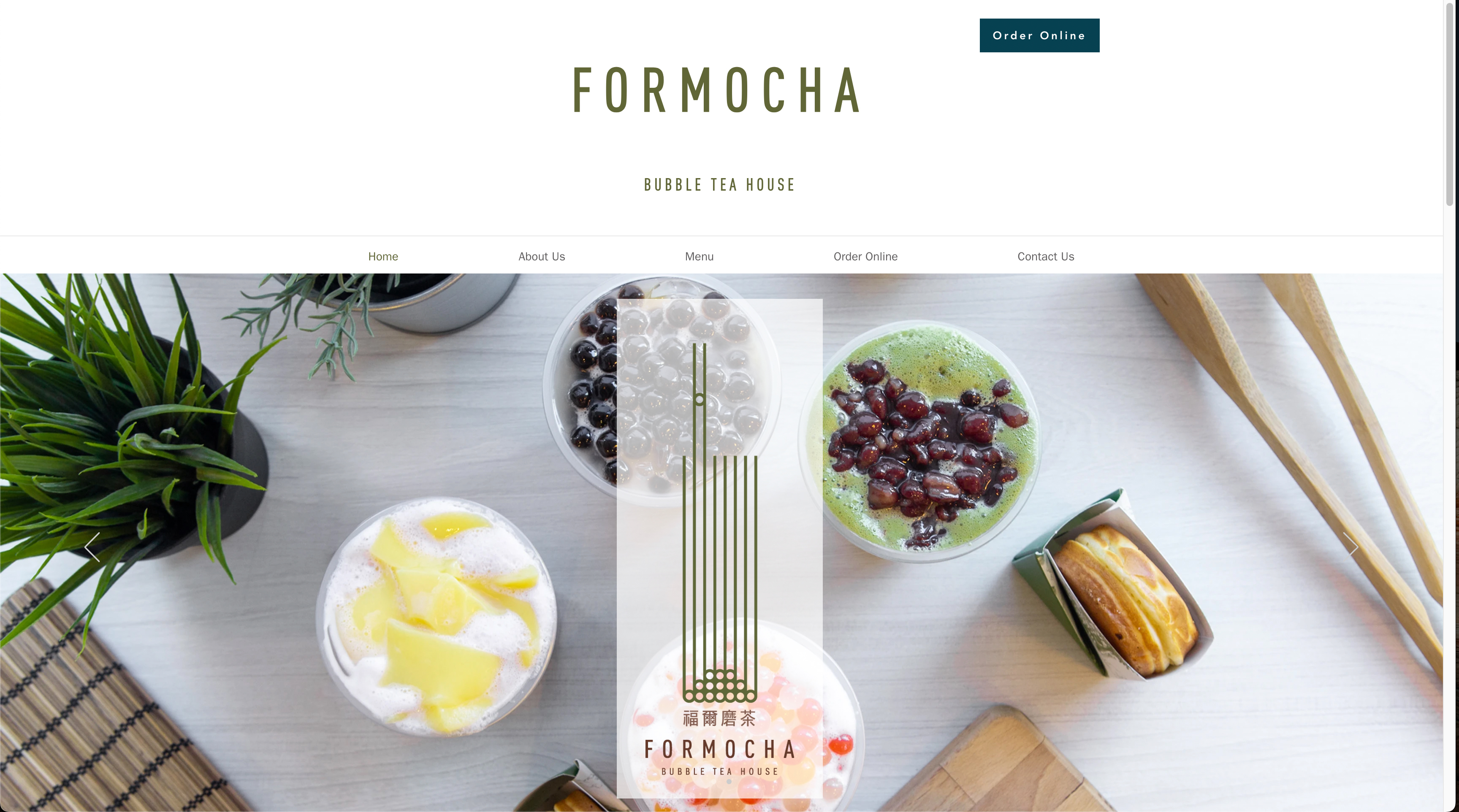
After reviewing the previous website, I noticed that the information architecture, structure & website responsiveness were not well-developed, potentially impacting user experience.
Before revamp – Landing page with hero carousel banner
I prioritized defining the key action we want website visitors to take:
1. Ordering online directly from a 3rd-party online platform.
2. Seeking for key information, such as menu, location, opening hours & contact.
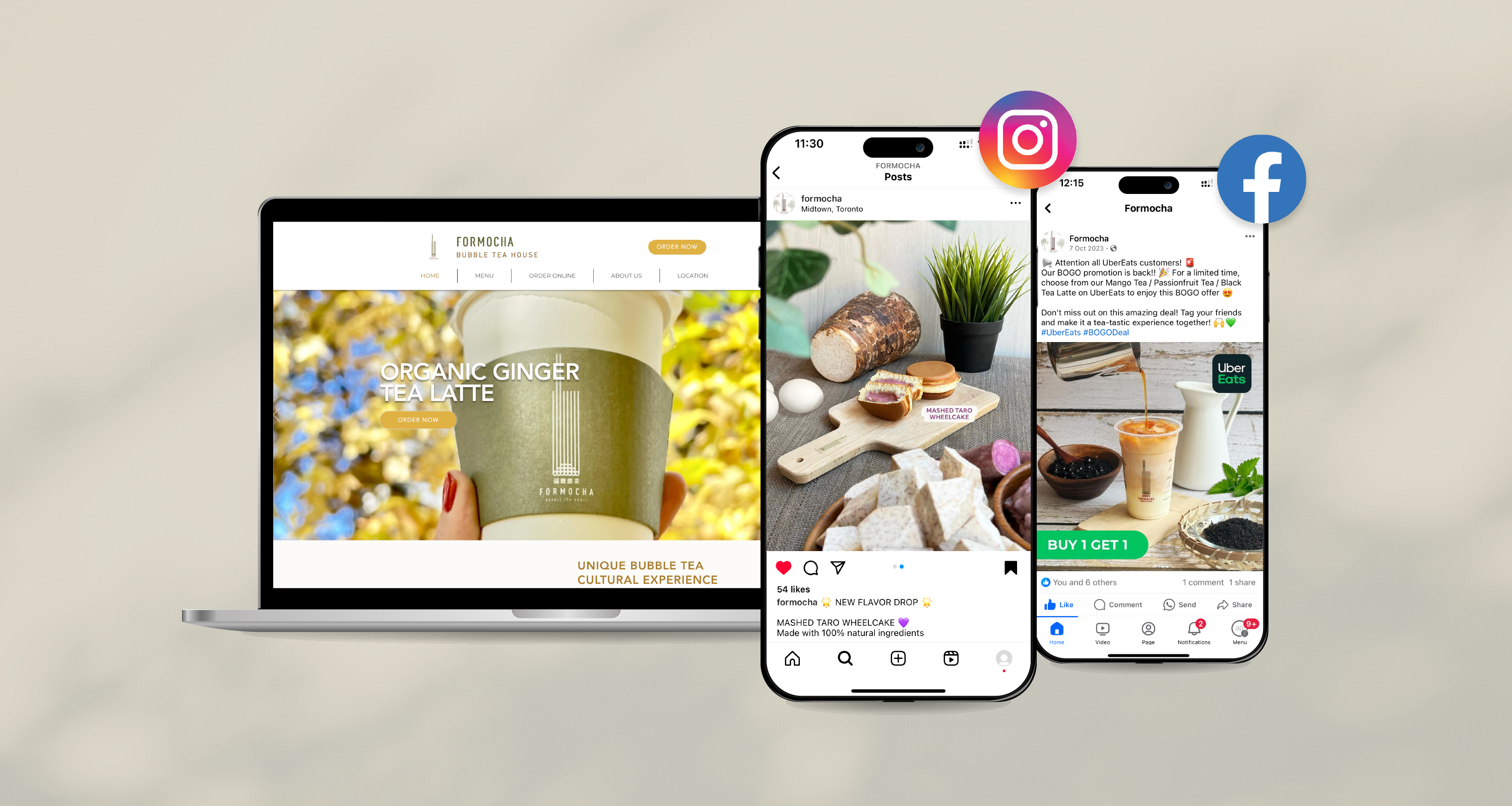
I improved the sales potential for our online orders by making the "ORDER NOW" call-to-action button more visible & consistently place it in the top-right corner across all pages. This makes it easier for customers to reach. Additionally, I optimized the navigation bar by placing the Menu & Location sections for easy access, enhancing the user experience & ensuring smooth navigation.
To maintain a consistent brand image, inserting appealing photos & relevant content is crucial, especially for a landing page. This approach helps attracting potential customers' attention and reduces the bounce rate.
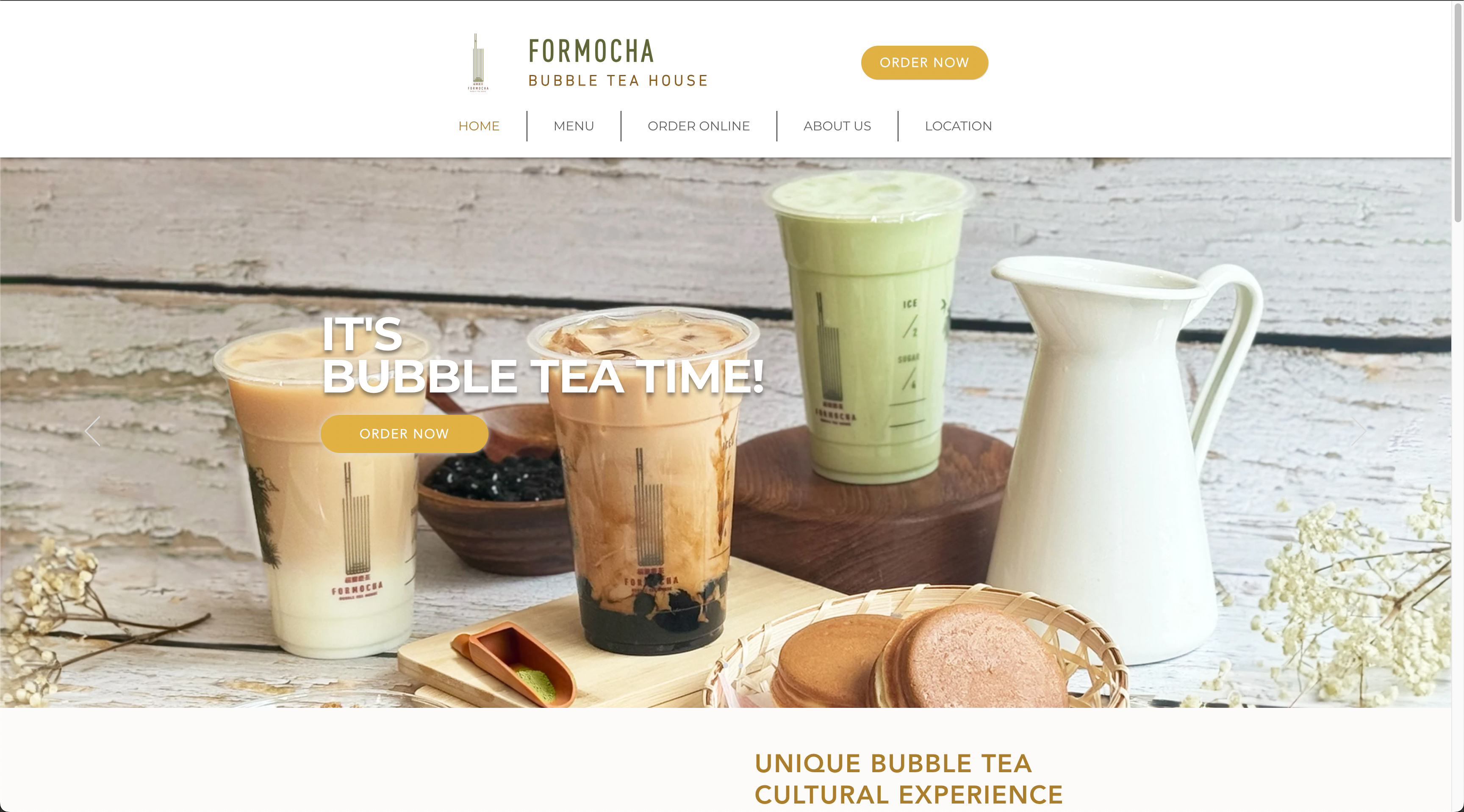
After revamp – Landing page with hero carousel banner
• Number of Unique Visitors is 70% better than other F&B catergory site*
• 10% of increase on traffic came from Social Media (Facebook & Instagram)
• Average session duration has increased to 2min+
* Metrics was provided from WiX